A visual representation or statistical chart showing the progression of an illness in an outbreak over time.
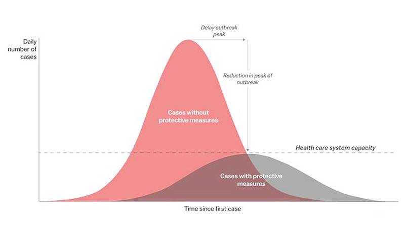
An epidemic curve is a type of epidemiological model that shows the frequency of new cases over time, based on the date of onset of illness, and allows epidemiologists to understand the trajectory of the outbreak.
Typically, with an epidemic curve, days are plotted against the horizontal axis and the number of infections along the vertical axis. Epidemic curves, regardless of the nature of the disease, typically follow a bell pattern which shows a peak in the number of cases, followed by a plateau, (or a leveling off) when the number of infections stays roughly the same over time, which is then followed by a decline in infections. See flattening the curve.
Epidemic curves give insights into the acceleration of the number of cases, and how long it takes for the number of new cases to decline. It indicates how the disease might spread in the future and this helps with management and allocation of resources (such as ICU beds and PPE), as well as informing decisions about potential lockdowns and containment measures.
Categories:
Epidemiology Infectious Disease Prevention
Cross-reference:
Epidemiological modelsFlattening the curveICU (intensive care unit)LockdownContainment measuresPPE (Personal Protective Equipment)Epidemic